秘術の鍛冶
Arcane Forge, Eclipse Of The Shadow Realm
Open-world tactical turn-based RPG — full UI/UX layer designed inside a studio simulation.
Role
UI/UX Designer
Team
IAC Game UI Studio simulation
Duration
8 weeks
Platform
PC · Controller
The challenge
A studio simulation, not a school project
Arcane Forge was built as a studio simulation — multiple designers shipping one open-world Tactical Turn-Based RPG together. The hard part wasn't designing one screen, it was creating a shared visual language so every designer's work felt like part of the same world.
The solution
Shared system, anonymous competition
We locked the design system first — Arcane purple, cyan and magenta accents on deep black, Cinzel for epic headings, Inter for legibility. Then every designer submitted screens anonymously each round; the group voted purely on functionality and adherence to the guidelines, and the winners formed the final Master Deck of 8 mockups.
Who we designed for
The persona

オリ・レヴィ
Ori Levi
- Age
- 31
- Lives in
- Modi'in, IL
- Works as
- Software dev / DevOps · CS degree, ex-intelligence
- Social
- Married + 2 kids · plays late at night
"Don't oversimplify the UI for me — I want every number, every stat, every cooldown. That's the game."
Background
Ori is a hardcore gamer who lives and breathes complex systems — MMORPGs, RPGs, strategy and sims. He plays mostly at night after work and family, chasing infinite challenge, full transparency and total control over the mechanics. He'd rather have a denser, more analytical UI than one that hides numbers from him.
Goals
- ◯Competitive supremacy — always staying in the top tier
- ◯Endless depth — content that doesn't run out
- ◯Optimisation — finding the strongest possible build
- ◯System mastery — actually understanding the algorithm under the hood
Frustrations
- ◯UI that oversimplifies and hides information
- ◯Hidden mechanics with no in-game explanation
- ◯Lack of transparency around damage / stat numbers
- ◯Unclear balancing between classes and builds
- ◯Pay-to-win monetisation
Habits & feelings
- ◯Reads every tooltip, log and tutorial — twice
- ◯Cross-checks builds against community guides and theorycrafting
- ◯Keeps spreadsheets / second screens open while playing
- ◯Treats games as a community — shares builds, debates patches
Personality
- ◯Analytical and detail-driven
- ◯Loyal — sticks with one game for hundreds of hours
- ◯Slightly introverted, very online
- ◯Skeptical of flashy marketing, trusts data and player reviews
- ◯Treats gaming as a serious craft, not a casual hobby
Visual rules
Design system.
Before any single screen was designed, the studio locked a tight set of visual rules so every designer's work would feel like part of the same world. Three pillars: an arcane high-contrast palette, an epic-meets-system font pairing, and sharp, glowing fantasy elements over deep black.
Palette
Arcane on void black
Void Black
#0B0B14
Base background — keeps the HUD recessed
Arcane Purple
#7A3CFF
Primary brand & magical energy
Cyan Pulse
#22E1FF
Active, selected and hover states
Magenta Spark
#FF3DA8
Critical actions, damage and warnings
Rune Gold
#E8C36B
Loot, rarity and progression highlights
Mist Grey
#A6ADC8
Body text, tooltips and disabled states
Typography
ARCANE FORGE
Cinzel SemiBold
Epic feel — titles, screen names, hero quotes
DMG 248 · MANA 64 · CD 3.5s
Inter
Maximum legibility for system UI, stats, tooltips
01
Sharp frames
Hard-edged angular borders and rune-style corners — never soft pill shapes. Frames frame the world, not the UI.
02
Inner light
Glowing inner shadows and gradient halos behind icons make magic feel real without flooding the screen with effects.
03
Minimalist icons
Single-weight, silhouette-first icons. Status, buffs and debuffs are readable in a fraction of a second mid-combat.
04
Three accents max
Purple, cyan and magenta carry meaning — never decoration. No screen uses more than three accent colours at the same time.
What I did
My contribution
- ◯User research via Google Forms — 65% of respondents said an over-loaded HUD breaks immersion in open-world RPGs
- ◯Translated insights into clear pain points and a hardcore-gamer persona (Ori Levi, 31) that anchored every screen decision
Screens
The work
01
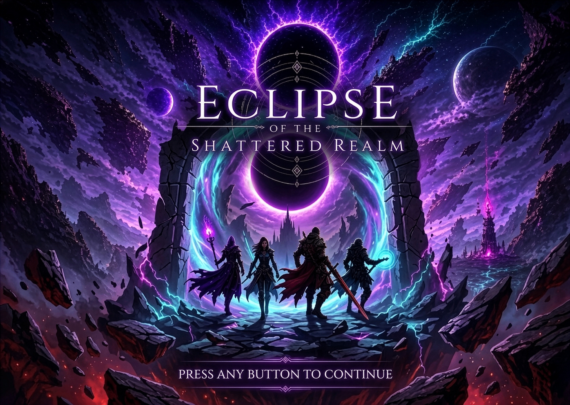
Splash Screen
The first frame players see — a cinematic key art opening that sets the tone of the Shattered Realm before the game begins.
02
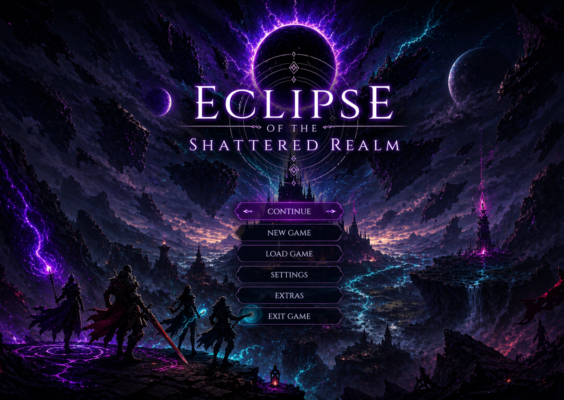
Main Menu
Continue, New Game, Load, Settings, Extras and Exit — anchored over the hero landscape with a clear focus state on the primary action.
03
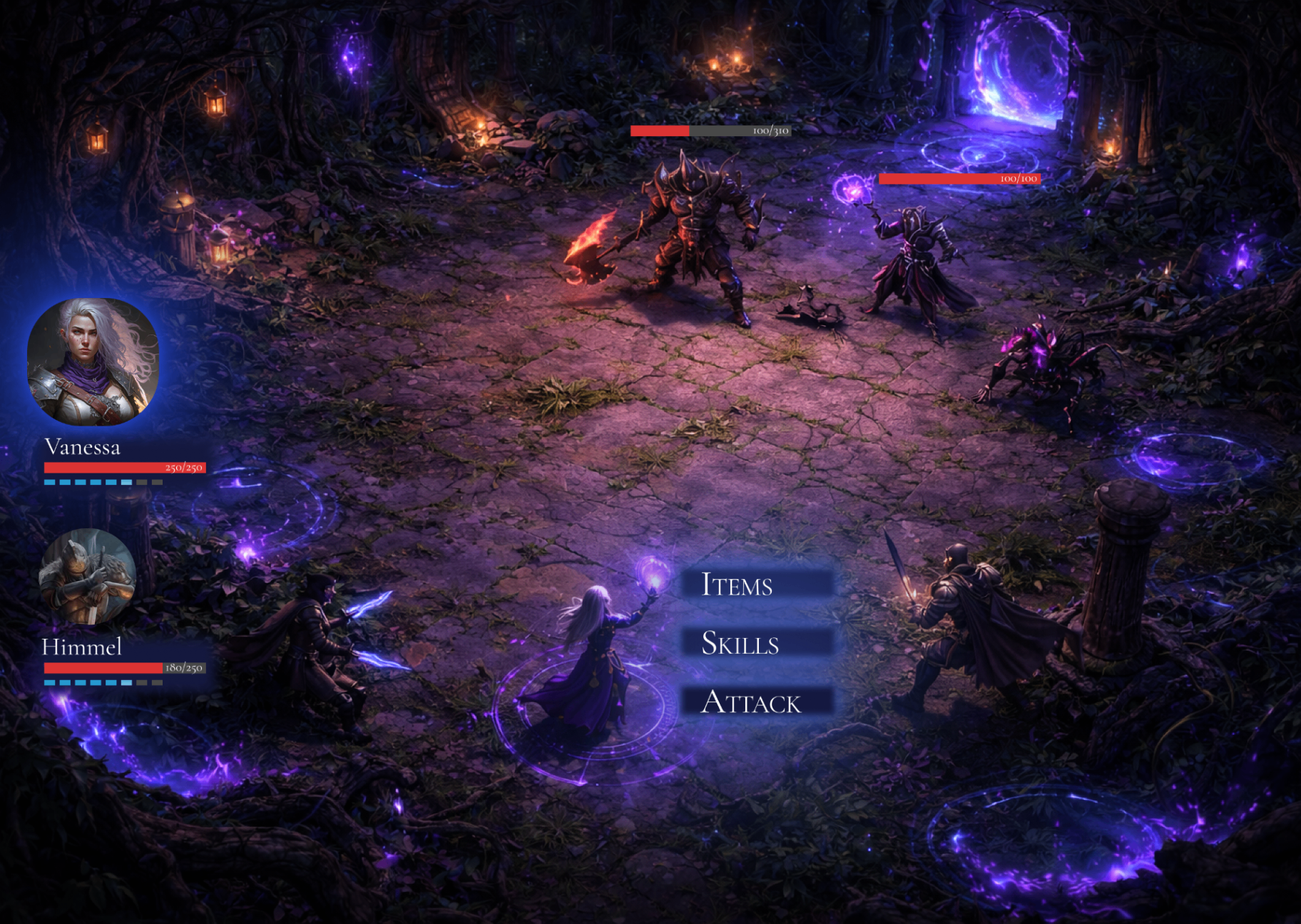
Gameplay HUD
Turn-based combat view with party portraits, HP bars, enemy health and a context action wheel (Items / Skills / Attack) kept out of the action.
04
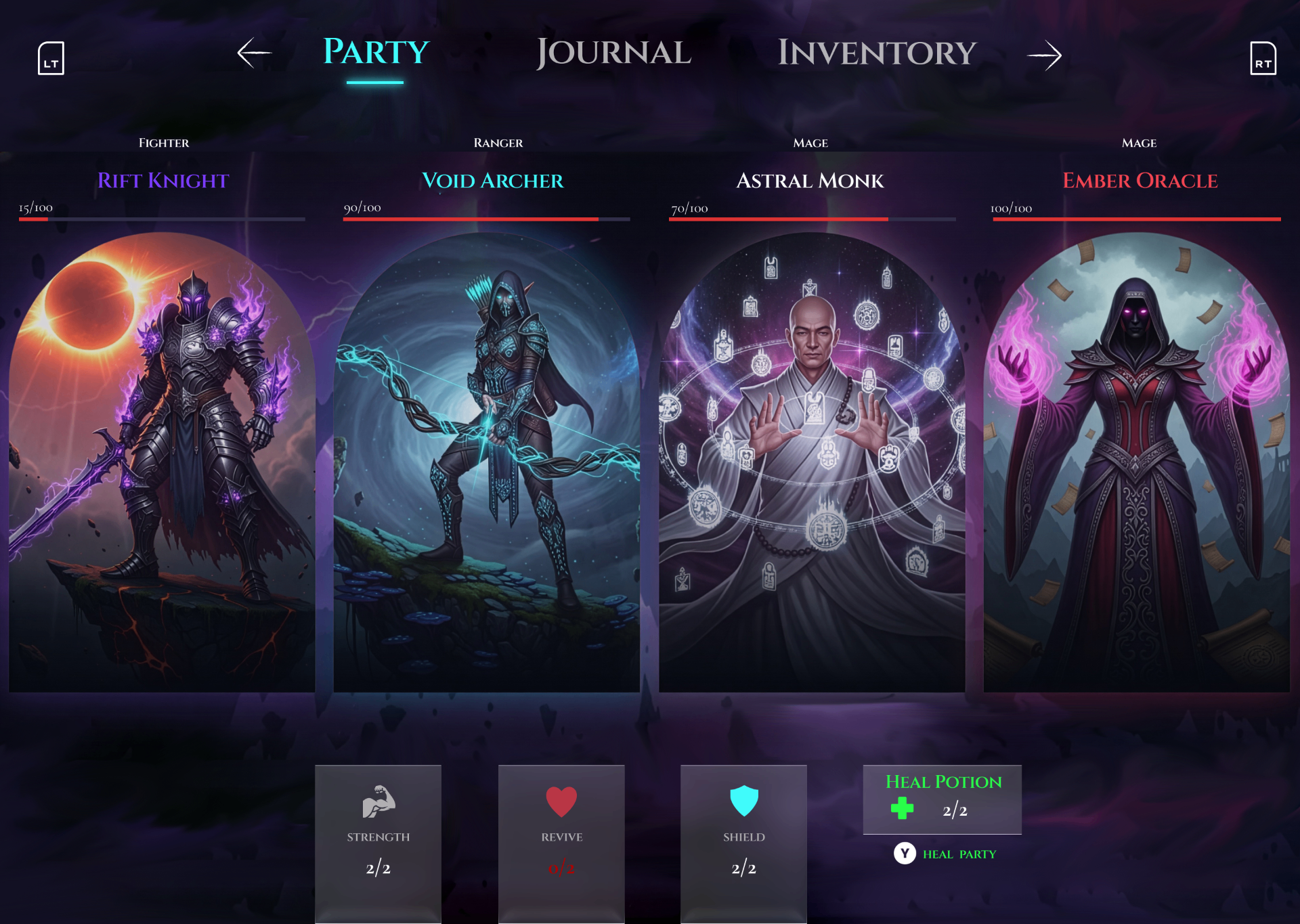
Party Selection
Rift Knight, Void Archer, Astral Monk and Ember Oracle — class, name and HP per hero, with shared party resources docked at the bottom.
05
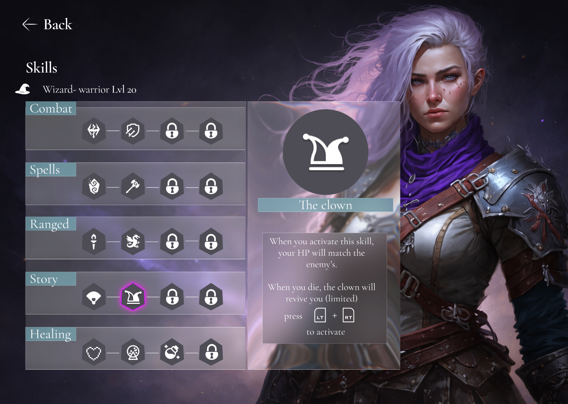
Skill Tree
Combat, Spells, Ranged, Story and Healing branches with hex-node progression and a live preview of the selected skill on the right.
06
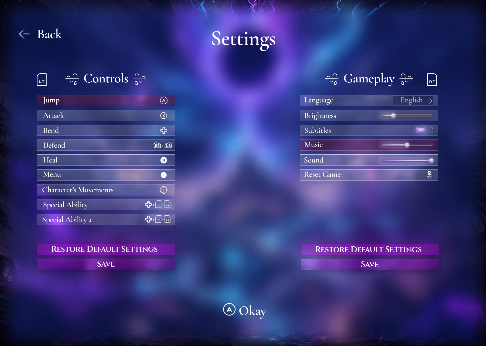
Settings
Controls and Gameplay side by side — gamepad-first key mapping, language, brightness, audio sliders and reset, all on a single readable screen.